Friday 29 November 2013
Representations of my magazine/ Target audience
I am going to be presenting artists who are both male and female, of all ages and of the Rock/Alternative/Indie/Punk/Grunge genres. I am going to be presenting these artists to my young target audience which are also both male and female and ages 15-25, so the way I represent the artists will be important as it has to appeal to them. I am going to present the artists lifestyles in a positive way which will appeal to the audience. Men and women are going to represented as equal so it appeals to the audience who are both male and female.
Questionnaire Responses


The first three questions show me who my target audience will be. 56% of people who answered my questionnaire was male and 44% was female. This tells me that there is almost an even split between the two which means I should make my magazine suitable for all genders. Most of the people I asked fitted in the age range of 15 - 18 and 18 - 20. This doesn't necessarily mean that only people aged 15 - 20 will read my magazine as I did get a lot of younger people to fill in my questionnaire. However I may target my magazine to people who are aged 15 - 25. Most people who answered my questionnaire belonged in group E, a small percentage in group C1 and B. This is because I asked mainly students anyway and if I conducted the questionnaire survey on a larger sample I think the results may have been a bit different.
I have decided from these results that the target audience of my magazine will be both male and female, aged 15 - 18 and will belong to group B, C1 and E.


Q4 showed me what genre of music most people listen to and most picked Rock, Alternative, Grunge, Indie, Pop and Punk. This tells me that my magazine should feature all these genres of music, mainly Rock and Alternative, as they were the most popular. I originally wanted to feature Rock/Indie/Punk/Alternative/Grunge music so I don't need to change the genres that much.
I had asked what artists would they like to be featured on a music magazine. The most popular responses were Arctic Monkeys, The Specials, The Smiths, Oasis, David Bowie and Led Zeppelin. This tells me that people prefer more popular and legendary artists over small indie artists. This tells me that I should feature bigger and more popular artists from the Rock/Alternative genre.

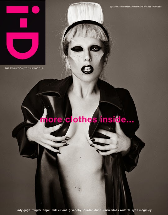
I gave examples of ID and NME for this question.I used ID for the simple one and NME as the more information. Most people picked simple with a very small percentage picking more information. This means that my magazine front cover is going to be pretty simple as that was what the majority wanted.

This question helped me find out what people's fashion styles are. Mainstream/Fashionable was most popular with Rocker being second. These results along with Q8, which gave me Qualitative results will help me find out what style people are into. For Q8 I got answers like, Miles Kane, Alex Turner, Alexa Chung and David Bowie. This means I will add get the look features in my magazine.

I asked this question to find out which house style I should follow and black came out as top with blue being second. My original idea was to have a black and blue house style anyway so there is no need to change that.

For this question I got more people voting for modern than old. However there isn't that much of a difference between the two results, so I have decided to feature both in my magazine.

Most people are willing to pay between £2.50 and £3.50 so my magazine will be priced at a similar price.
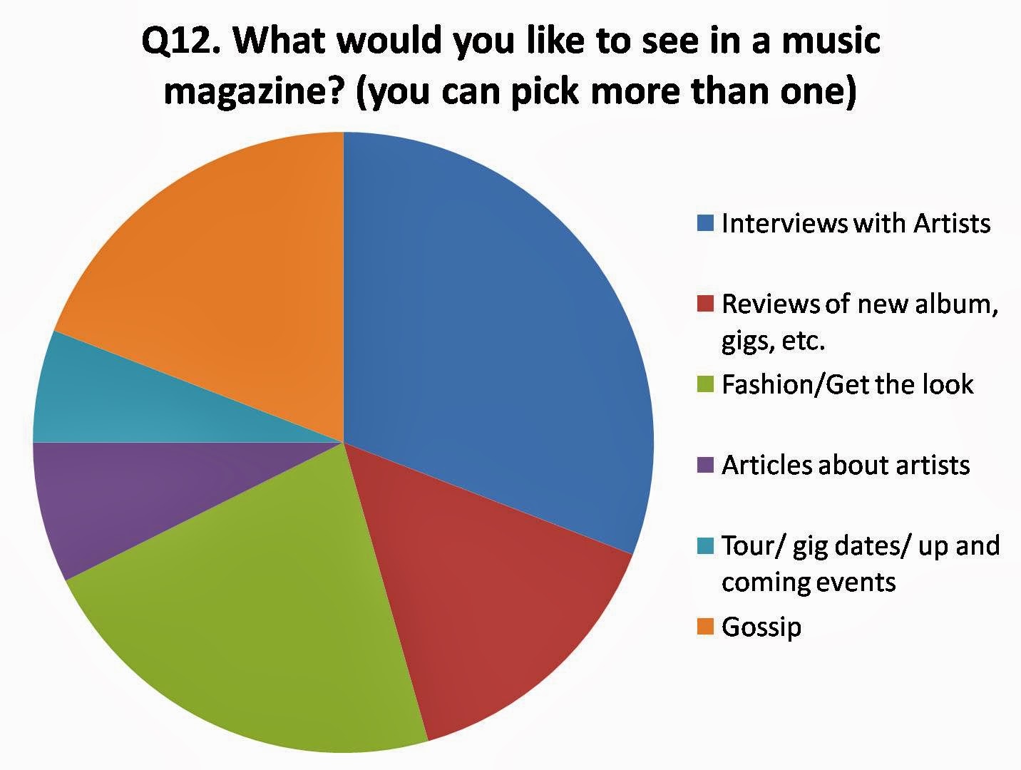
Most people wanted to see interviews with artist, fashion/get the look and gossip. My original idea was to do fashion/get the look for my magazine and I wanted my magazine to focus on fashion as well as music and I was quite shocked that it was so popular in the questionnaire. This means I am definitely going to feature the fashion aspect of music in my magazine.
Wednesday 27 November 2013
Layout Plan Ideas
Layout plan is a simple line drawing that shows the structure of the magazine.
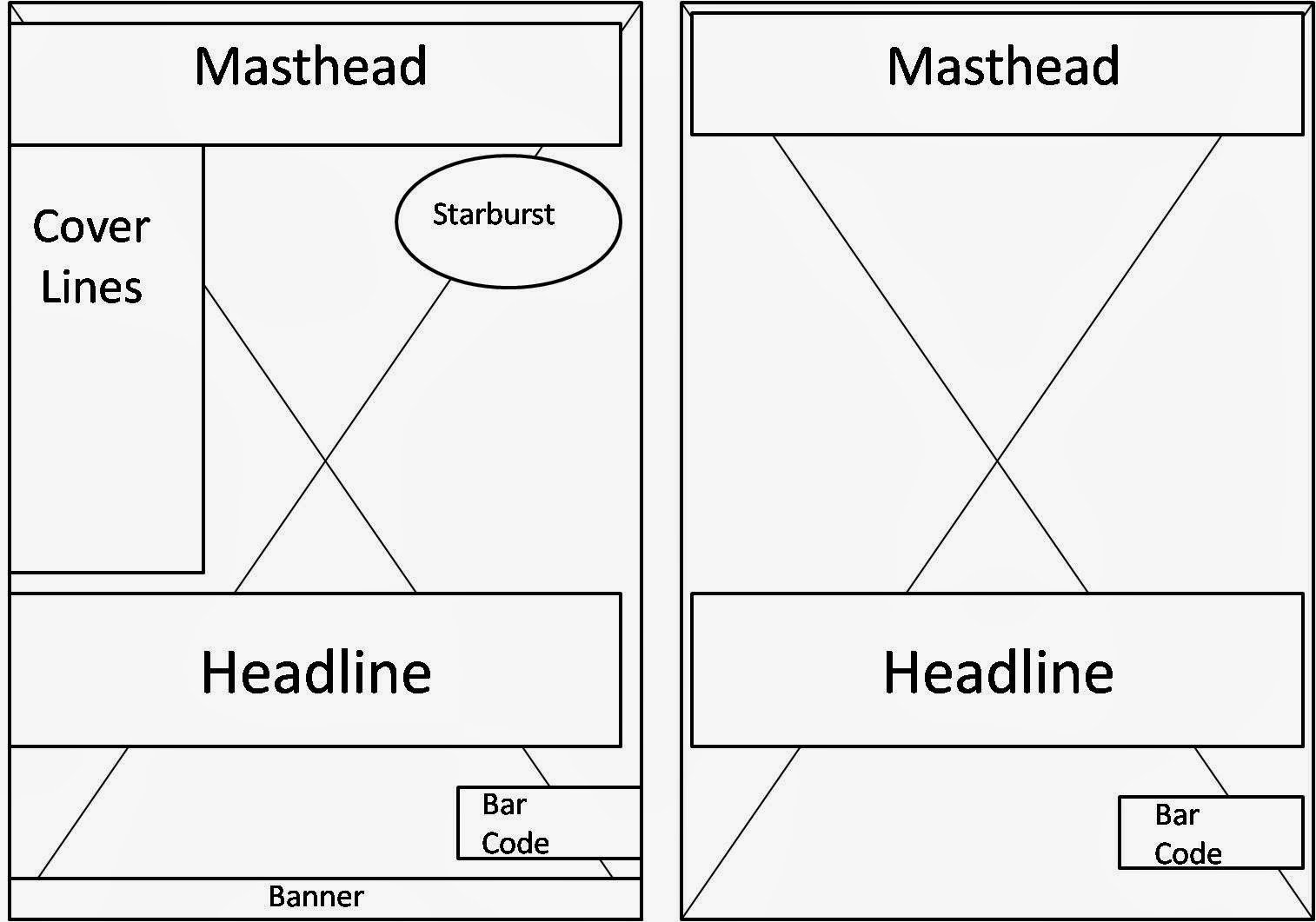
For the first one the main image is centre, so it takes up the whole page and all the other elements will overlap over it, the main image will be the main attraction so it takes up the whole page . The masthead is right at the top of the page so our attention is drawn straight to there so it is easily recognisable and identifiable. The cover lines are above the headline and they are on the left as that is where our eyes track to first naturally. The headline is underneath the cover lines so it stands out. The bar code is at the bottom right and is small so it doesn't take up much space and isn't very noticeable. There is a banner at the bottom of the page.
The second one is more simple as there are no cover lines so there is more attention on the main image and the headline. The masthead is at the top of the page so it easily recognisable. The headline is near the bottom of the image and will be over the top of the image. This is a good place to put the headline as it doesn't draw attention away from the main image. The bar code is still at the bottom right and is small so it doesn't take up much space and isn't very noticeable.
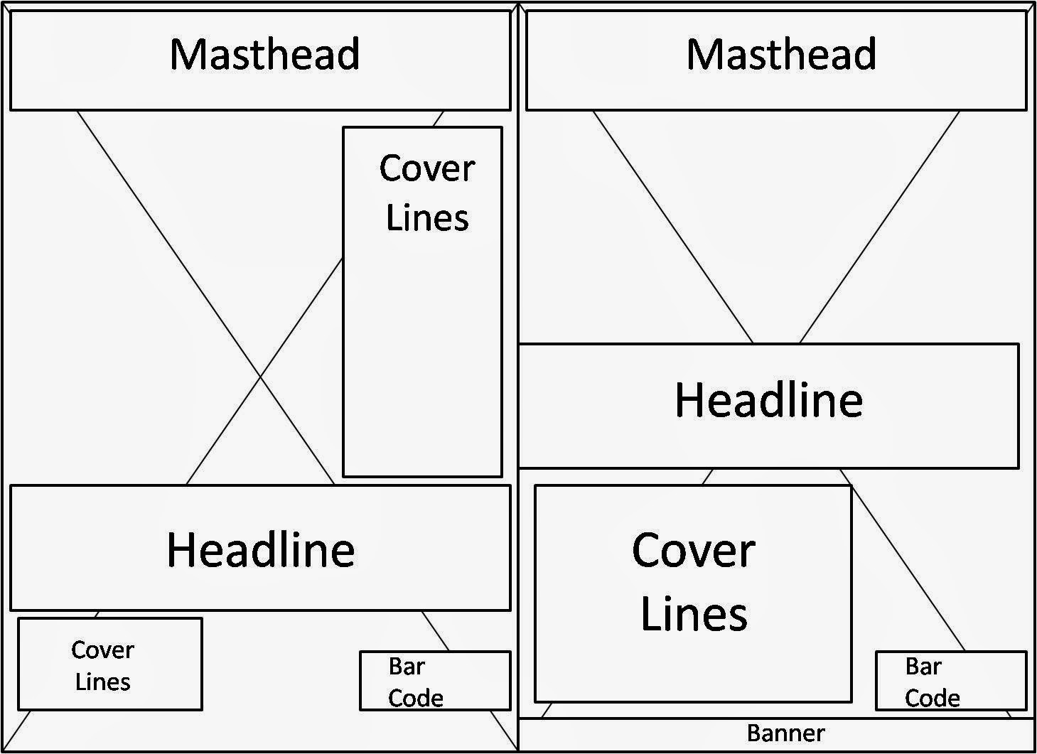
For the first one the masthead is at the top of the page so it is recognisable and stands out. The cover lines are above the headline on the right so main image and the headlines are the focus and the cover lines do not overtake them. There are also cover lines underneath the headline on the left so extra cover lines can be added. The bar code is at the bottom right and is small so it doesn't take up much space.
The second one has the masthead at the top again so it's recognisable. The headline is in the middle of the image, this headline will be saying what the image is about so it won't actually distract away from the image itself. The cover lines are underneath the headline and there is enough space for a lot of them. There is a banner at the bottom so more information can be added. The bar code is at the bottom right and is small so it doesn't take up much space.
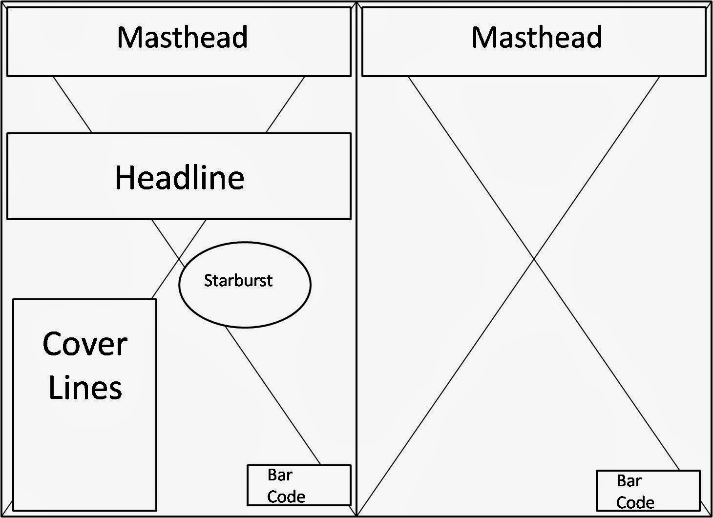
The second one has a masthead at the top so it is recognisable. There are no headlines or cover lines and the main image will be the central focus. This means the front cover heavily relies on the quality of the photography and the image itself has to tell the audience what it is about without words. The bar code is at the bottom right and is small so it doesn't take up much space.

For the first one the masthead is at the top of the page so it is recognisable. The headline is at the top of the image and there are no cover lines so the page is still quite simple and the focus is on the image. However there is a banner at the bottom for information as there are no cover lines. The bar code is at the bottom right and is small so it doesn't take up much space.
The second one has a masthead at the top of the page so it is recognisable. There are two starbursts one above the headline on the right and one below the headline on the left. The headline is in the middle of the page and the coverlines are underneath the headline on the right. The bar code is at the bottom right and is small so it doesn't take up much space.
Monday 25 November 2013
More Masthead Ideas
Saturday 16 November 2013
Questionnaire
1. What gender are you?
[ ]
Male
[ ] Female
[ ]
Other
2.Which age range do you fit in?
[ ]
12-15
[ ]
15-18
[ ]
18-20
[ ] 21-30
[
]30+
3. Which one of these applies to you?
[ ]
Group A (Professionals) – Upper Middle Class e.g. Doctors, Barristers,
Executives
[ ] Group
B (Managerial) – Middle Class e.g. Bank Managers, Teachers
[ ]
Group C1 (Non – Manual) – Lower Middle Class e.g. Office Workers
[ ]
Group C2 (Manual) – Skilled Working Class, Blue Collar Workers e.g. Car
Mechanics, Machine Operators, Construction Workers
[ ]
Group D (Partly Skilled) – Semi or Unskilled Manual Workers e.g. Assembly Line
Workers
[ ]
Group E (Unskilled) – Casual Workers, Dependent on state benefits, Students
4.What genre(s) of music do you like? (You can
pick more than one)
[ ]
Pop
[ ]
Rock
[ ]
Metal
[ ]
Indie
[ ]
Grunge
[ ]
Alternative
[
]Punk
[ ]
Ska
[ ]
Reggae
[ ]
Rap
[ ]
RnB
[ ]
Hip Hop
[ ]
Country
[ ]
Folk
[ ]
Garage Rock
Other (please specify)
________________________________________________________________
5. What artists would you like to be featured on a
music magazine? (You can pick more than one)
[ ]
Arctic Monkeys
[ ]
Queens of the Stone Age
[ ]
Drenge
[ ]
Nirvana
[ ]
The Clash
[ ]
The Specials
[ ]
The Smiths
[ ]
The Cribs
[ ]
Oasis
[ ]
Franz Ferdinand
[ ]
Blur
[ ]
The Black Keys
[ ]
Black Rebel Motorcycle Club
[ ]
Bob Dylan
[ ]
David Bowie
[ ]
The Doors
[ ]
Foals
[ ]
The Jimi Hendrix Experience
[ ]
Joy Division
[ ]
New Order
[ ]
Lana Del Rey
[ ]
Led Zeppelin
[ ]
The Libertines
[ ]
Macklemore
[
]Palma Violets
[ ]
Swim Deep
[ ]
Peace
[ ]
Vampire Weekend
Other (please specify)
_________________________________________________________________
6. Do you prefer a simple front cover or one with
more information?
 [ ]
[ ] [ ]
[ ]
7. How do you describe your fashion sense?
[ ]
Mainstream/fashionable
[ ]
Feminine
[ ]
Boho
[ ]
Emo
[ ]
Glam
[ ]
Preppy
[ ]
Urban
[ ]
Goth
[ ]
Professional
[ ]
Indie
[ ]
Vintage
[ ]
Rocker
Other (please specify)
_________________________________________________________________
8. And do you think the music you listen to
influences your taste in clothes? If so which artists inspire your choice in
clothing? (please specify)
_________________________________________________________________
9. What colours do you like?
[ ]
Black
[ ]
Blue
[ ]
Red
[ ]
Yellow
[ ]
Purple
[ ]
Pink
Other (please specify)
_________________________________________________________________
10. Do you prefer modern or old music?
[ ]
Modern
[
]Old
11. How much are you willing to pay for a music
magazine?
[ ]
50p -£1.50
[ ]
£1.50 - £2.50
[ ]
£2.50 - £3.50
[ ]
£3.50 -£4.50
[ ]
£4.50 - £5.50
[ ]
£5.50 - £6.50
12. What would you like to see in a music magazine?
(you can pick more than one)
[ ]
Interviews with artists
[ ]
Reviews of new albums, gigs etc
[ ] Fashion/style/Get
the look of artists
[ ]
Articles about artists
[ ]
Tour/gig date / up and coming events
[ ]
Gossip
Other (please specify)
_________________________________________________________
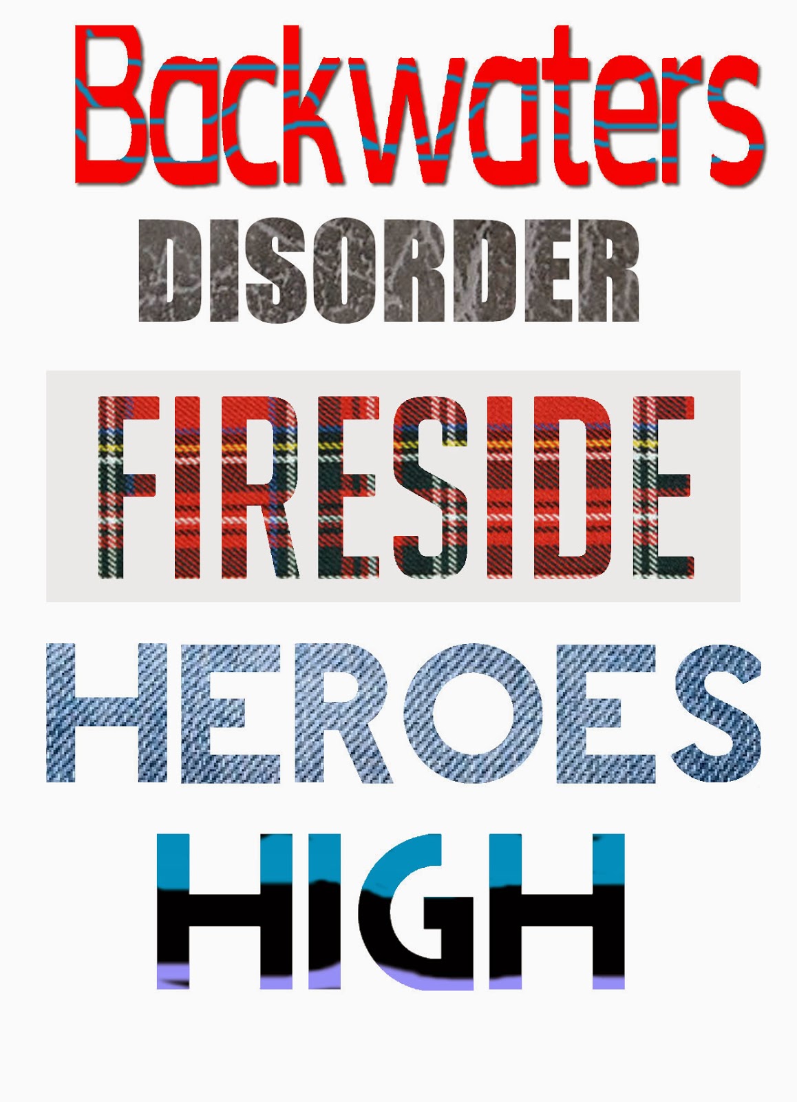
Masthead Ideas

Here are my masthead ideas. They are all simple and one word, this will make them memorable and easily recognisable. I have used the colours black and blue because that's what I want my house style to follow. They are all music related as they are the titles of some songs, apart from drenge (which is a band). This means they will relate to the audience of my magazine ,who will be mainly men aged 16-25 that read magazines like NME and appreciate music.
Wednesday 13 November 2013
Tuesday 12 November 2013
Ideas for the name of my magazine
- Ghost Town
- Watchtower
- Anenome
- Ashes to Ashes
- Atmosphere
- Backwaters
- The Bad Thing
- Bankrobber
- Black Dog
- Blue Monday
- Bros
- Catapult
- Cigarette Smoke
- Cornerstone
- Disorder
- Dogmeat
- 3s and 7s
- Evil Eye
- Fireside
- Hurricane
- Iris
- Kashmir
- Life On Mars
- Lithium
- London Calling
- Mad Sounds
- Manic
- Pretender
- Haze
- Riot
- Secret Door
- Sequels
- Soul Love
- Starman
- Ulysses
- 505
- Drenge
- Radioactive
Monday 11 November 2013
NME's Brand Identity and Value

Brand Identity-NME focus' on new music and not particular genres. However NME is usually associated with indie music. The masthead is usually red with a white boarder so it easily recognisable. The main image of the magazine is usually a close up or mid shot of the artist(s) and then their name in bold as the headline. All the artists featured on the front cover are either part of the rock, alternative or indie genres NME features.
Brand Value- NME find live music an important part of live and does a lot to promote live music. It also believes in new up and coming artists as many of them are on the front cover. NME stands for 'New Musical Express' which means they value new music. NME also values old music as they sometimes that people like Morrissey.
Rolling Stone's Brand Identity and Value
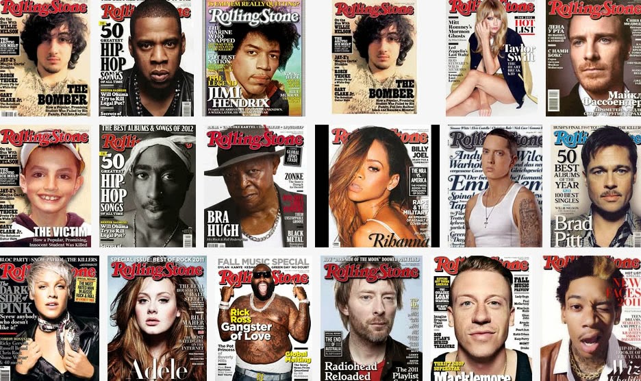
Brand Value - Politics, style and pop culture is important to Rolling Stone.
Thursday 7 November 2013
Brand Values
BRAND VALUE – Things that are deemed important by a brand, the things that it stands for and it represents.
The brand will prioritise good music and good sense of style. It will heavily focus on the artists themselves and care for older music. The magazine will stand for the rock and roll lifestyle that some artists have. Records, albums and even live music are important.
The brand will prioritise good music and good sense of style. It will heavily focus on the artists themselves and care for older music. The magazine will stand for the rock and roll lifestyle that some artists have. Records, albums and even live music are important.
Tuesday 5 November 2013
Brand Identity
BRAND IDENTITY - is what the brand is associated with and how the visual appearance makes it distinctive. This could be the use of colour, fonts, style of imagery, layout and house style.
The brand focus’ on the artists themselves and the masthead will be simple. The main image will be the main focus as it will be a close up image of the artist and there will only be a main headline on the page as I don’t want it to look cluttered. The magazine will associate with its audience who are into fashion and the genres of music the magazine is associated with- rock/indie/punk/alternative/grunge. The main image will be simple and modern. The image will impact what the music is about e.g. the artist could be frowning-rock music.
The brand focus’ on the artists themselves and the masthead will be simple. The main image will be the main focus as it will be a close up image of the artist and there will only be a main headline on the page as I don’t want it to look cluttered. The magazine will associate with its audience who are into fashion and the genres of music the magazine is associated with- rock/indie/punk/alternative/grunge. The main image will be simple and modern. The image will impact what the music is about e.g. the artist could be frowning-rock music.
Subscribe to:
Posts (Atom)