


Model
Location
Lighting
|
Mise-en
scene
|
Camera
angle/shot
|
Example
|
Nicole
Helen
Lauren Leila
Somewhere
with a white background
High
key lighting
|
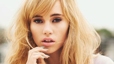
Hair-
Curly and big
Makeup-
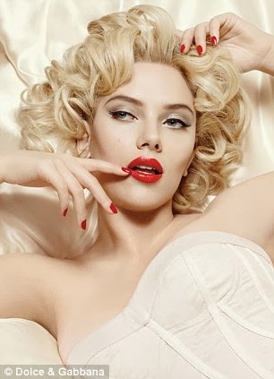
Flawless skin, matte red lip (MAC Ruby Woo), bronzer, winged eyeliner –
eyeshadow is neutral – light flesh toned colour on the lid and medium brown
in the crease(bare lower lashline NO MASCARA ON BOTTOM EYELASHES) – lots of
mascara on top eyelashes , maybe some corner lashes to elongate the
eye-eyebrows have high arch to lift the eye and exaggerate the winged
eyeliner- NO BLUSH ONLY LIGHT BRONZER TO HOLLOW OUT
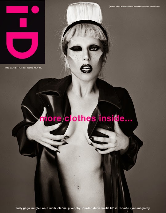
CHEEK BONES- Pin Up
inspired makeup
Costume-maybe
a black grungey hat, paisley shirt buttoned to the top, denim jacket and high
waisted black jeans.
Props-
maybe an electric guitar
Setting-
white background
|
Close
up- maybe eyes closed to see the eyeliner or smiling at the camera or just a
blank expression or lip bite
|
 |
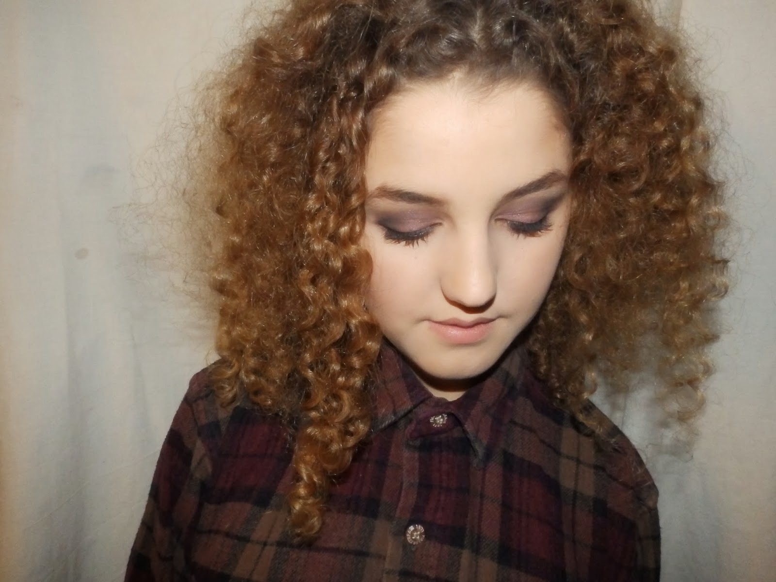
Helen
Lauren - 14/12/2013
Somewhere
with a white background
High
key lighting
|
Hair-
Curly and big
Makeup-
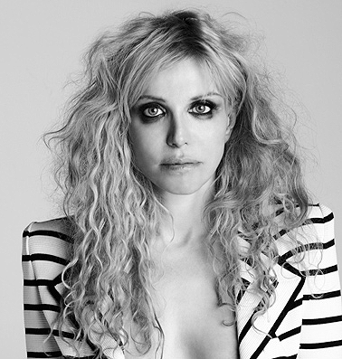
tinted moisturizer and no concealer under the eyes-tired looking skin-maybe a
pink stained cheek and a bit of a cool toned bronzer to hollow out the
cheekbones. For the eyes a cranberry cream eyeshadow blended around the eye, needs
to be quite messy looking to go with the grunge theme- lots of mascara can
even be a little bit smudged-ALL ADDS TO THE LOOK. Either a blanked out nude
lip, red lip-not very defined can be smugdey-adds to the heroin chic look
e.g. Courtney Love.
Costume-maybe
a black grungey hat, plaid shirt buttoned to the top, denim jacket and high
waisted black jeans.
Props-
maybe an electric guitar
Setting-
white background
|
Medium
close up so we can see a bit more of the costume and so the makeup isn’t so
in your face. Subject can have a blank facial expression- dead looking
|
 |
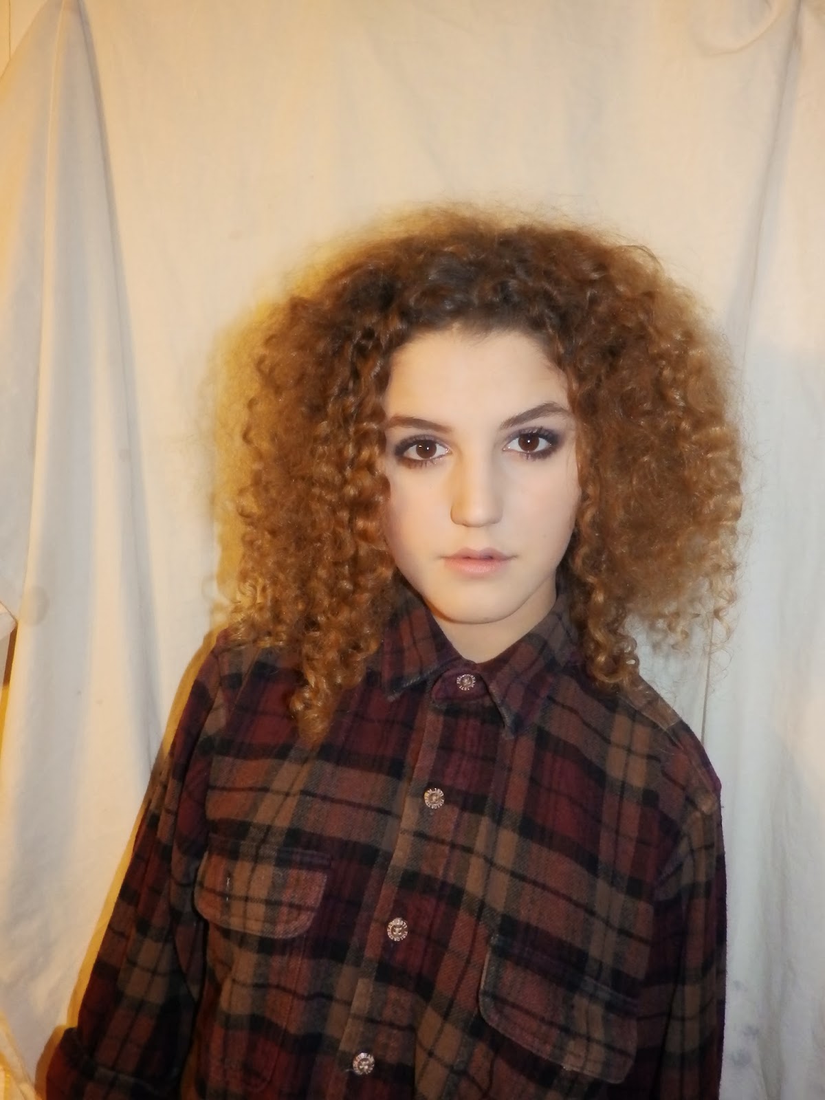
Nicole
Helen
Lauren
Somewhere
with a white background
High
key lighting
|
Hair-
straight
Makeup-
Natural bronzey makeup – mix in a darker foundation-no powder- lots of
bronzer but no contouring. Natural eyebrows – Bronze cream eyeshadow blended
only on the top lid and a shimmer brown eyeshadow on the lower lash line for
definition and not a lot of mascara. Natural coral toned nude lipstick and a
bit of lipgloss.
Costume-Cream
dress, black grungey hat
Setting-
white background
|
Medium
close up and subject will be smiling at the camera.
|
 |
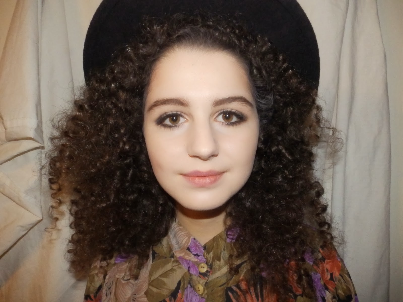
Nicole-14/12/2013
Somewhere
with a white background
High
key lighting
|
Hair –
Big and messy
Makeup-
60s mod style- flawless skin, pink blush- neutral eyeshadow but defined
black/very dark brown cut crease. Strong winged eye liner – more of a curvy
flick rather than a straight one. Lots and lots of mascara and fake eyelashes
maybe even draw some
underneath the lash line. Pink nude lips.
Costume- flowery shirt
Setting-
White background
|
Close
up with collar showing. Subject can be looking straight at the camera.
|
 |


 [ ]
[ ] [ ]
[ ]
