Monday 14 October 2013

What I Have Learnt


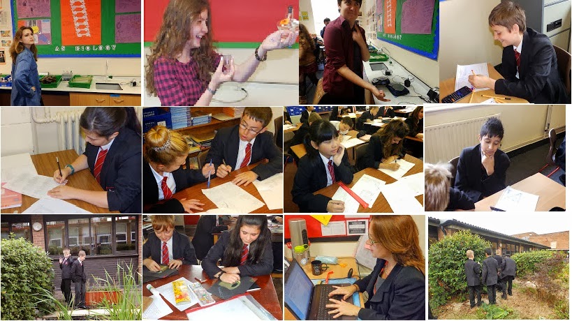
I have learnt about camera angles/shots and the different types; extreme long shot - the person or people of significance can be seen as well as the background, long shot - head to toe shot of person or people, mid shot - person or people from waist upwards, medium close up - person or people from shoulder to face, close up - just the face and extreme close up - eyes or any other feature on the face. 
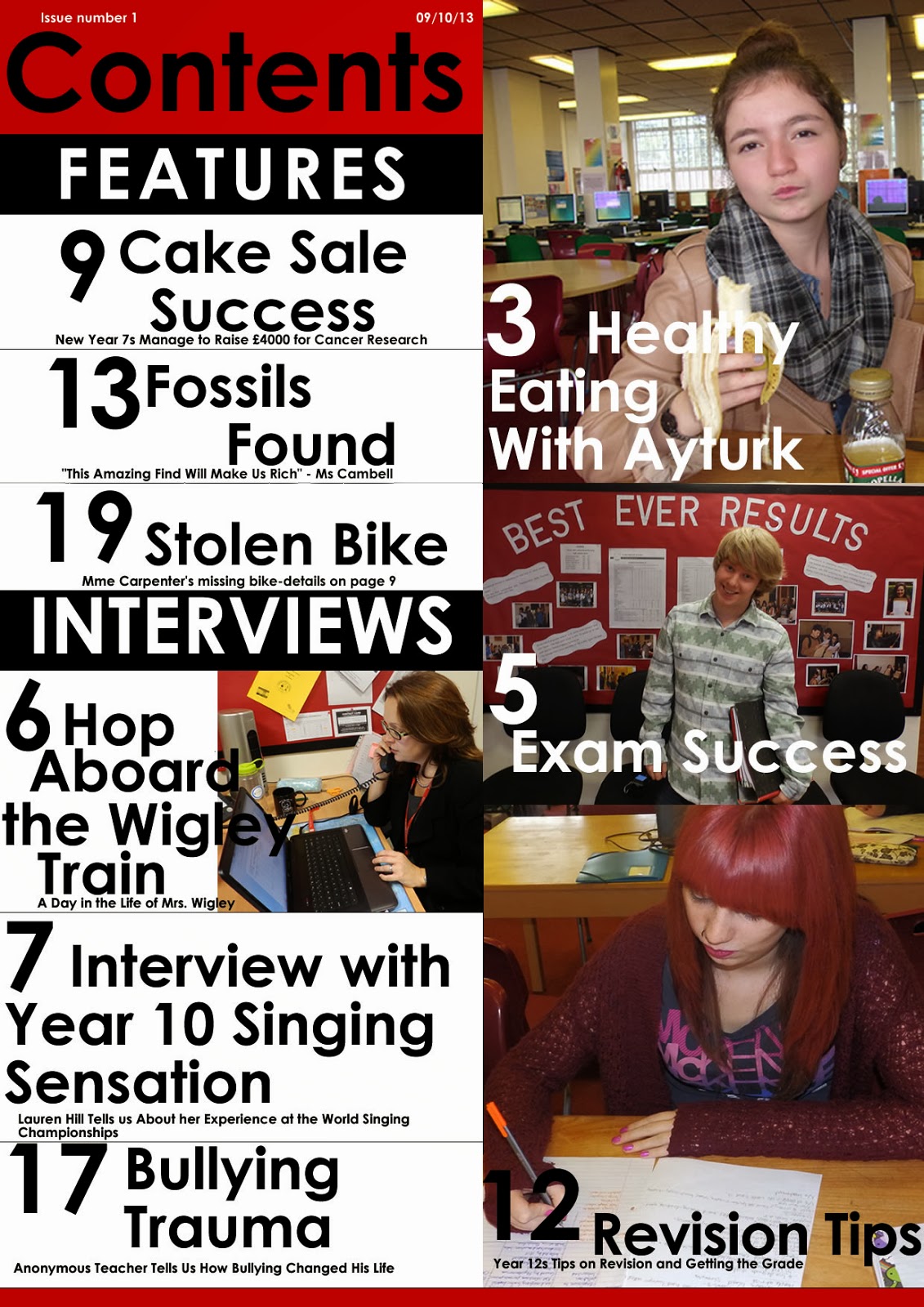
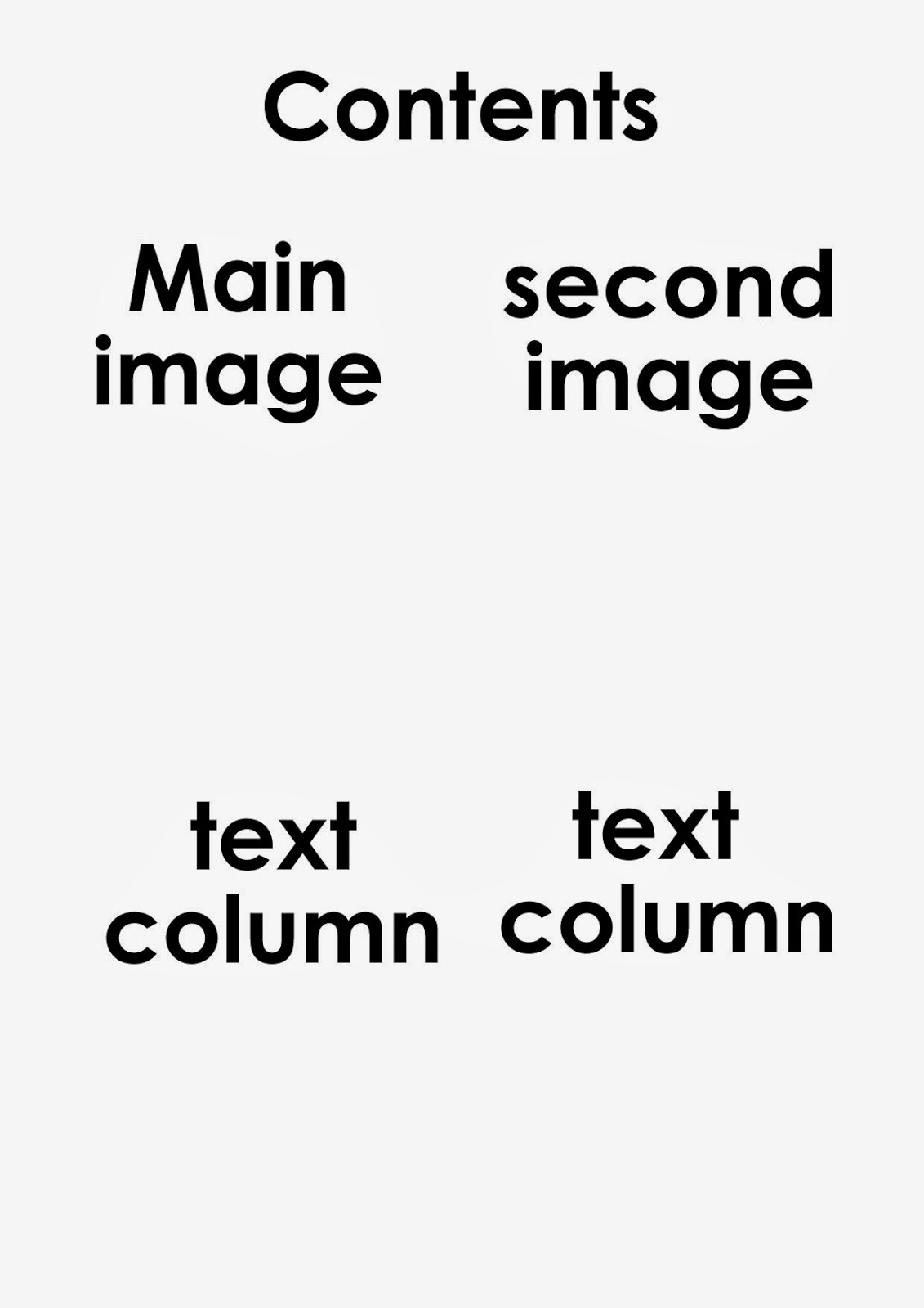
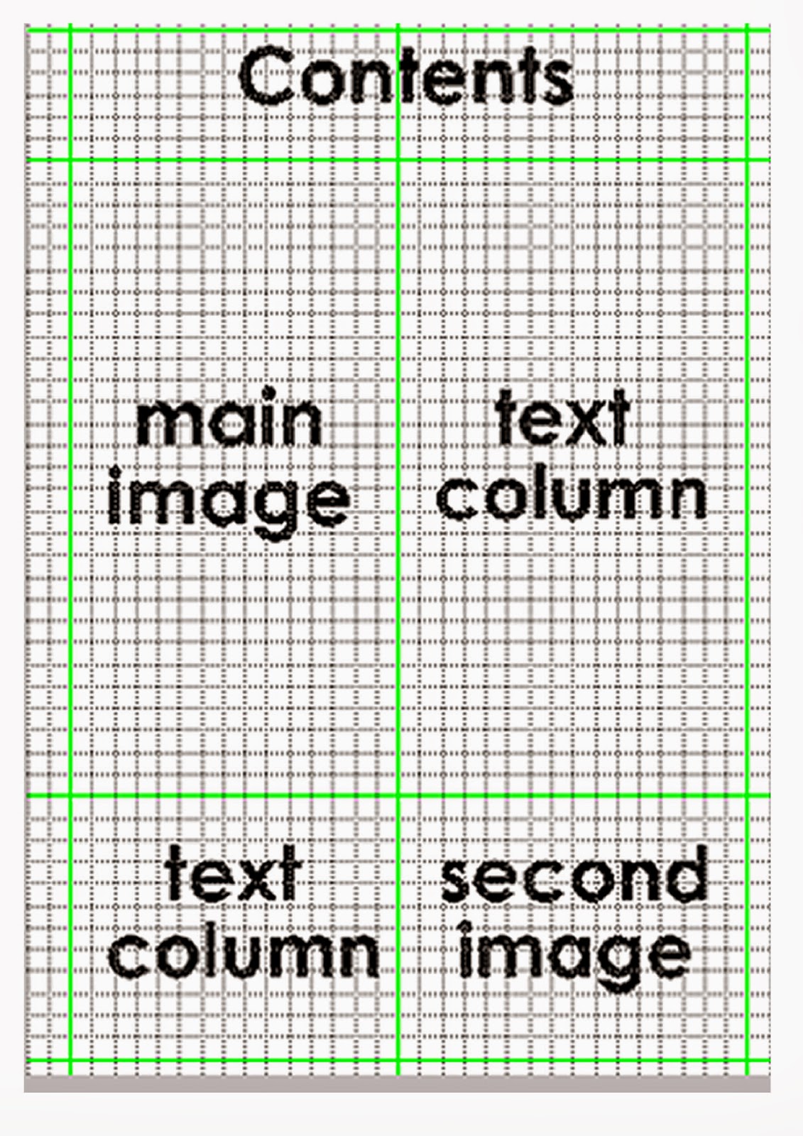
I have also learned all the key conventions of a front cover and contents page. 

  • masthead 
  • headlines
  • coverlines
  • features
  • articles
  • pull quotes
  • lure
  • puff
  • serif style font
  • sans serif style font
  • pug/starbursts
  • layout
  • house style 
  • visual syntax
  • straplines 
  • hook
  • banner 
  • photo 
  • masking
  • use of colour
  • page numbers
  • issue number and date
  • information/blurb
  • categories 
  • font size variation

I also learnt how to use various tools on fireworks. Like the blurring tool which I used for my main image on the front cover. I have learnt how to make mastheads and pugs on fireworks.
I learnt about denotation which is  the literal meaning of a word. Connotation is an idea or meaning suggested by or associated with a word or imagery.
I learnt about primary and secondary audiences.
Media texts are specific media products, such as the sun newspaper and media form is all media products such as tv programmes, films, CDs, books, newspapers, web pages etc.

Pictures I Took


Type of content


  • School rules
  • articles about homework
  • highlights
  • news
  • uniform
  • pb radio
  • discussions
  • adverts for events
  • club schedules
  • tweets
  • letters from ms campbell
  • achievements
  • statistics
  • interviews from teachers
  • meal of the day
  • gossip page
Front Cover Conventions

Friday 11 October 2013

Final Contents Page


The layout is in columns so everything looks professional. The columns have there own titles 'features' and 'interviews'. This is so that all the headlines are organised and everything fits on the page. I used four pictures relating to the articles. The page numbers are in size 130 font so that they are eye-catching and stand out against the other text on the page. I have used a pull quote under the 'Fossils Found' headline. This lures the reader into reading the article. The title 'Contents' is in largest font on the page. This is for emphasis so it stands out against everything on the page. I have placed the title at the top left of the page. This is similar to the placing of my masthead on my front cover so the layout looks professional. The headlines are in size 78 font and tell us what the article is about. I have also followed the house style from the front cover which is red, black and white. The issue number and date are at the top left on top of the title. This is to tell the audience how recent the magazine is. I have used blurbs underneath the headlines and I have used size 18 font so that it doesn't detract from the headlines.

Final Front Cover


The masthead is at the top left of the page and is the first place people look. It is the largest font on the page so it is recognisable and eye-catching. The font is sans-serif so it appeals to the younger audience. It follows the colour theme red, white and black so it fits the house style.
The headline 'Interview With Year 10 Singing Sensation' is in bold, white, sans-serif font. This is so it stands out against all the other coverlines. It is also in a bigger font than the coverlines. Important words like 'Interview', 'Year 10' and 'Sensation' are in bold so they stand out.
The coverlines are underneath the main headline and have transparent banners underneath them so they stand out against the image. The colour of the text alternates between red and white sticking with the house style and the image.
The Puff 'school is cool' is underneath the the masthead and it is a lot smaller than the masthead. This shows us that it is not as significant as the masthead. 
Sans-serif font doesn't have hooks, brackets and feet, it's informal, modern and youthful. Sans-serif font is used throughout the front cover. This is so it appeals to the younger audience.
There is a Pug/Starburst on the page that says '100% Pass rate' in black writing around a black circle so it is eye-catching against the background. It is placed in the centre of the two girls so it stands out.
The layout is organised and well spaced out. It isn't cluttered as there isn't a lot going on.
The house-style is red, white and black. These are the school colours and they link with the central image as the girls are wearing school uniform, black blazer, white shirt and red tie. 
Visual Syntax- The masthead 'pb swag' is the first thing we see as it has the largest font. Then we go down to the image, then the main headline then the coverlines and back to the pug.
There is a banner at the bottom of the page saying 'school motto poster included!'. It is in black font over a red banner so it still follows the house-style.
Use of colour-The colours are all contrasting and stick with the overall house-style and image. This attracts attention as it looks professional as everything matches and the contrasting colours highlight everything on the page.

Tuesday 8 October 2013

Front Cover Picture Ideas


The house style that is used in other magazines is often matched up or contrasted with the colours the person in the picture is wearing.
For my school magazine I could use a picture of a student wearing school uniform so it can match the school housestyle.
My Ideas

  • A picture of a student in school uniform, doing work. This should be a mid shot or medium close up.
  • A picture of a student reading a book on a bench. This should be a mid or long shot.
  • A picture of two student walking into school, smiling. This should be a mid shot.
  • A picture of a student in a classroom, putting there hand up, asking for help. This should be a mid shot.
  • A picture of a teacher helping a student- teacher sitting with student pointing at the work. This should be a mid shot or long shot.
  • Students doing a science experiment, wearing a lab coat and goggles. This should be a mid shot.
  • Two students sitting on a bench, looking at the camera, smiling. This should be a mid shot or medium close up.
In the end I decided to go with the two students sitting on the bench, smiling. I used this picture because it clearly shows the uniform, so I can match up the house style with the image itself. As the image is outside, in daylight, there is high key lighting. The two girls are smiling as if to show they are very happy at school. I also blurred out the background so the girls are the main attention on the page. I feel like my picture shows school spirit.


Contents Page Layout 2


Monday 7 October 2013

Contents Page Layout 1


This is my first contents page layout. I have put the main image on the left as this is where our eyes travel first and I want the main image to be centre of attention. I put the text column underneath the main image and on the side of the main image. I want this to be the second thing people look at and there should be quite a lot of contents so I have used two spaces on the page. I also think that some of the contents can maybe overlap over the main image. The second image should be the last thing people look at. The image is either going to be related to one of the contents or the image is going to have a caption under it.

Conventions of a Contents Page


Layout- set out in columns. It makes the magazine look more profession as everything  is in an order.
Pictures- maybe a main image the rest of the page is centered around and maybe small images relating to the contents/ other articles.
Page numbers- to show where to find it in the magazine and they are usually in bold or large font for emphasis.DO NOT USE 'p.g.' or 'page'
Pull quotes- to lure the reader to read the article
Title (Contents)- to show that it's a contents page
Headlines-to show what the articles are about
Banners- blocks of colour on the top or bottom of the page to highlight important information.
House style/colour scheme- so it looks professional and follows the rest of the magazine so it recognisable.
Issue number and date- to see how recent it is.
Information/Blurb- to give a little information about what the article is about
Categories- sections the articles fit in e.g. new, interviews etc. This organises it so it looks less cluttered.
Fontsize variation- larger fonts used for page numbers to emphasise or smaller font for the blurb.