Wednesday 29 January 2014

Analysis of a Contents Page

Layout- set out in boxes with a picture of the featured article and a bit of information about the featured articles. This neat layout keeps it looking professional. It can also attract fans as the artist is featured.
Pictures- there are 8 pictures that links with the each of the articles, with the main articles image right in the centre.
Page Numbers- there are clear page numbers on the bottom of each picture. They are in a black font on a white background.
Pull Quotes- on all of the featured articles, apart from the main article. This lures the reader to the article.
Title- It doesn't follow the normal conventions of a contents page as it doesn't say the word contents, however it does have a title saying 'Inside This Week'
Headlines- The headlines are the pull quotes.
Housestyle- is black and white which is followed throughout
Issue number/date- the date is written under the title
Font Variation- is used thoughout, as the page number is the biggest, then the headline, then the blurb/information.

Monday 27 January 2014

Examples of Contents Page


Coventions of a Contents Page


9th and 10th Mock Up

The masthead is at the top left of the page in a bold blue/turquoise sans serif font with a black border. I found the font on Dafont. This is the first place people will look and it is the largest font on the page as it is what makes the magazine recognisable.
There are some coverlines underneath the masthead. The name of the artist is in the same colour font of the masthead and is larger than the little bit of information under each of them, which is in a smaller black font. There is a rectangle underneath each of the coverlines, to make them stand out against the background, however to make them look less obnoxious I have made them a bit transparent.
The main headline is underneath the coverlines. There is a pull quote 'I'm Bloody Crazy!' which is in a smaller font than the artists name, however they do have borders to make them stand out against the background. The artists name 'Lauren Hill' is in a large white font, this attracts fans. 'My Top 5 Albums' is in the same size font as the pull quote.
There are some more coverlines, which are introduces with a large italic 'PLUS'. They are just names of artists which alternate between red and white, for variation.
There is a banner at the bottom of the page which says 'Damon  Albarn Exclusive'. This is somewhat a coverline too.
There is a pug, which says 'free posters' this doesn't follow regular conventions of a magazine as its not a circle and have a couple of pictures on it.

The masthead is at the top left of the page in a bold blue/turquoise sans serif font with a black border. I found the font on Dafont. This is the first place people will look and it is the largest font on the page as it is what makes the magazine recognisable.
There are some coverlines underneath the masthead. The name of the artist is in the same colour font of the masthead and is larger than the little bit of information under each of them, which is in a smaller black font. There is a rectangle underneath each of the coverlines, to make them stand out against the background, however to make them look less obnoxious I have made them a bit transparent.
There is a pug on the top right of the page which says '100th Issue Special' '100 pages of Arctic Monkeys'.
The main headline says 'Nicole Hill My Top 5 Albums'. The first bit, the artists name, 'Nicole Hill' is in the largest white font as this attracts fans. The second bit of the headline says 'My Top 5 Albums' in a much smaller font, with a transparent rectangle underneath it. This helps it to stand out against the background.
There is a banner at the bottom of the page, which is the same colour as the masthead. It says 'Exclusive Interview With Damon Albarn'.

Sunday 26 January 2014

8th Mock Up


The masthead is at the top of the page. I rubbed a bit of it out so it looks like her hair is covering it. It is in a bold, black sans serif font, which I found on Dafont, as I didn't like any of the fonts on fireworks, as they were not bold enough. The Masthead is the biggest text on the page, so it stands out and it is was the magazine is recognised by.
There are some coverlines underneath the masthead on the sides of her head. For the main coverlines the name of the artist is in a bold blue/turquoise font, which is the same as the masthead. The information is in a smaller black font and there is a black line which divides each of the coverlines. There are six other coverlines, which are just artists names in a black font inside a white triangle.
The main image is a midshot. I did this as if it was a closeup there wouldn't be enough space to put coverlines. The model is looking straight at the camera, this makes eye contact with the audience so it draws them in.
The main headline reads 'Top 5 Albums Lauren Hill'. The whole headline is in the same font as the masthead and coverlines for consistency. The 'Top' and 'Album'  are in a bold white font and '5' is in a black font with a blue turquoise glow, so it stands out. 'Lauren Hill' is in a larger blue/turquoise font. This is because it attracts fans of the artists.
There is a banner at the bottom of the page with facebook/twitter/youtube details.

7th Mock Up

The masthead is at the top of the page, it is in a white transparent font, which I got off Dafont.
There are coverlines underneath the masthead on the right of the page. The name of the artist is in white and the rest of the coverline is in red. This makes the artists name pop out and will appeal to fans. It also follows the house style.
There is a pug just above the main headline with says 'WIN READING TICKETS'.
The Main Headline reads 'Nicole, My Top 5 Albums'. The first bit of the headline, 'Nicole' is in a larger white font whereas the rest of the headline is in a smaller font. This is so the artists name stands out and attracts fans.
There is a banner type thing at the bottom of the page which includes other artists.

6th Mock Up

The Masthead at the top of the page. It is in a bold, white transparent font, which I found on Dafont.
There is a pug underneath the masthead, overlapping the 'S' of 'BROS'. It says '100th ISSUE' in a black font inside a transparent, white circle with a khaki border. The khaki coincides with the khaki detailing on the models costume.
There are coverlines underneath the masthead on the left of the page. These are in a font that I found on Dafont, they alternate from khaki to white, this is for variation. I found that they didn't stand out enough so I put a drop shadow on all of the coverlines.
There is a khaki coloured '+', which introduces the main headline, 'Top 5 Albums, Nicole Hill'. The first bit of the headline 'Top 5 Albums' is in the same, but smaller font to the Second bit of the headline ' Nicole Hill',  as this will attract fans to the magazine. I put a khaki glow on the fonts so it stands out.
There is a banner type thing on the bottom left corner of the page, which says, '25 Pages Of Arctic Monkeys' in a black font on a white transparent banner.

5th Mock Up

The Masthead is at the top of the page in a white transparent font which I found on Dafont. It is a bold, sans serif font, which appeals to the younger audience of the magazine.
There are some coverlines on the left of the page underneath the masthead in a white font so it stands out against the dark background. There is a large '+' underneath the coverlines, to introduce the main headline. There is a pug underneath the masthead, that says 'WIN READING TICKETS' and '100th ISSUE'. There is a small black circle in the middle with '100th ISSUE' in white font, and there is a larger, white transparent circle over the top that has 'WIN READING TICKETS' in a black font.
The main headline 'Lauren, My Top 5 Albums'. 'Lauren', the name of the artist is in a large, white font as it stands out and draws the audience in to the artists. 'My Top 5 Albums' is in the same white font, just a bit smaller.
There is a banner at the bottom of the page, it is in a white, transparent colour, and has a black font saying 'Exclusive Interview With Damon Albarn'.

4th Mock Up

 
The Masthead is at the top of the page and has a gradient purple colour, that coincides with the purple detailing on the models shirt. I did this so everything fits together and flows nicely so it doesn't just seem like a random colour on the page, this means everything ties together. I rubbed out a bit of the masthead so it looks like her hair is over the top of the masthead.
There is a pug underneath the masthead that says 'WIN READING TICKETS' and '100th ISSUE'. It is small and in the centre there is a black circle with '100th ISSUE' in white writing and in the circle round the outside it is white, almost transparent, with black writing that says ' WIN READING TICKETS'.
In the image the model is looking straight at the camera, this is effective as it engages the audience, she is also putting her fingers up in a peace motion, which links with the positive brand values of the magazine.
I have put a couple of coverlines on her two fingers, as this is different and doesn't follow the usual conventions of a front cover, this also makes it look unique. There are three coverlines underneath the main headline, they have a transparent purple box underneath them, to help them stand out against the image. It is in a black font.
The main headline is 'Nicole, Top 5 Albums'. 'Nicole' is the first bit of the headline, this is in a white, almost handwritten type, font that I found on Dafont. This is so it stands out against  the rest of the font on the page. The 'Top 5 Albums' bit is in a purple font on a transparent black box.
There is a banner at the bottom of the page, which is in a white font on a purple box, which again fits with the house style.

Monday 20 January 2014

3rd Mock Up

The Masthead is at the top of the page, as this is the first place people will look. It is in a bold font, which has a grey leather effect, so it stands out and is unique.
There is a pug underneath the masthead. It says '100th Edition' and has a turquoise/green and black colour, so it follows the house style.
There are some coverlines underneath the pug, they are approximately the same width as the pug, so they are lined properly and it doesn't look messy. The coverlines are in a black font, which matches that of the house style. It is also in a small font so it doesn't detract attention from the main image or main headline.
The main headline is in a white font. The first bit of the headline, the artists name, 'Lauren Hill' is in a bold, white, handwritten font. This gives it an authentic feel, almost like a signature/autograph. This attracts fans to the magazine. The second bit of the headline, 'Lauren Talks About Her Top Five Albums' is in a smaller white font. This is for variation.
There is another coverline/banner thing at the bottom of the page, which reads, 'Exclusive interview with Damon Albarn' This is in a smaller green/turquoise font so it goes with the pug.

2nd Mock Up

The Masthead is at the top left corner of the page as this is the first place people will look. It is the largest font on the page and is in a bold, bright turquoise font, which has a border around it so it stands out against the image. It fits in with the house style which is turquoise, white and red.
The first bit of the headline, which is the artists name, 'Nicole Hill', is in a bold, handwritten type font. This is different to the rest of the text on the page so it stands out. This will attract fans to the magazine. The second bit of the headline, 'Nicole Talks About How Her Top Five Albums Inspired Her', is in a smaller font that is in a turquoise colour. This is the same colour as the masthead, so it all fits in nicely with the house style.
There are some Coverlines underneath the Headline on the right of the page. This is so they don't overtake the headline, hence being in a smaller font. They change from red to black back to red so there is variation.
I edited the main image on PicMonkey, but I didn't change the colour as I wanted to keep the image authentic looking. It is a close up image and the model is looking at the camera, making eye contact with the audience.

Monday 13 January 2014

Double Page Spread Article Thing


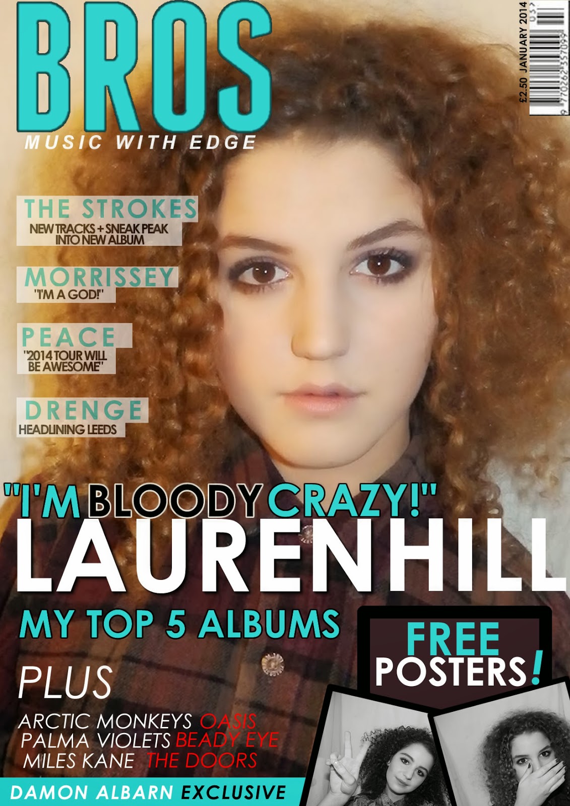
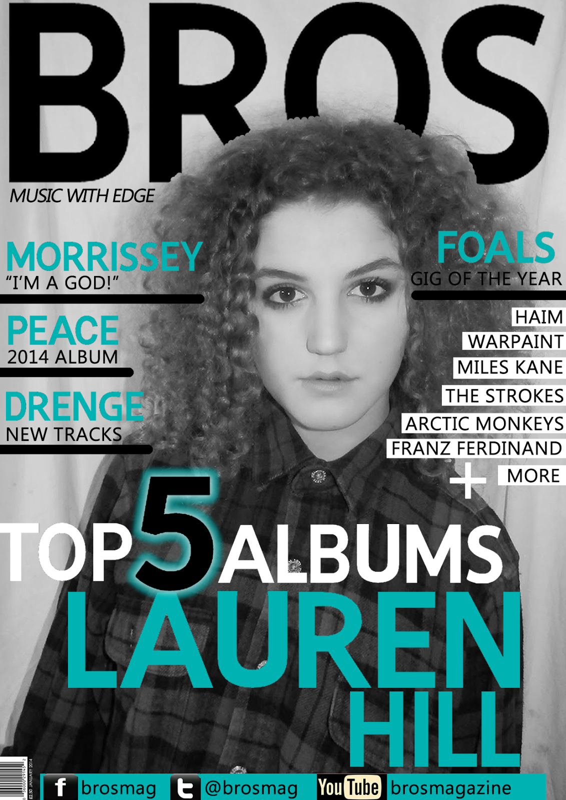
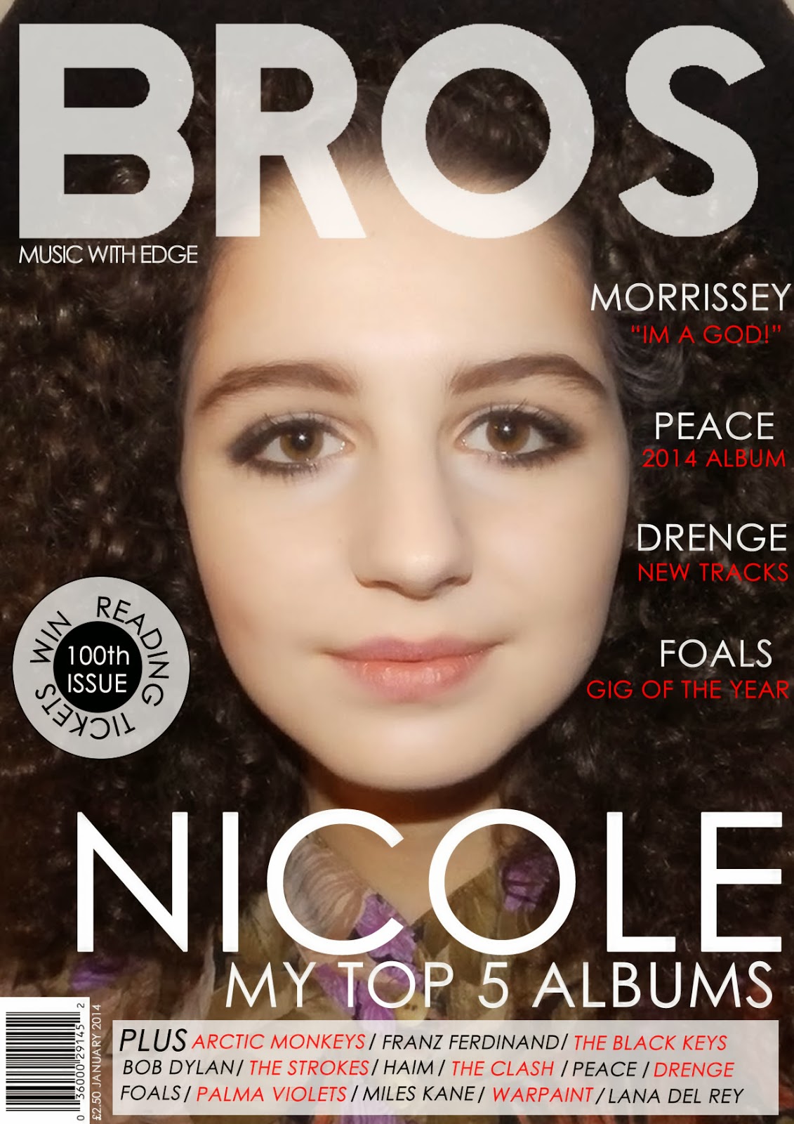
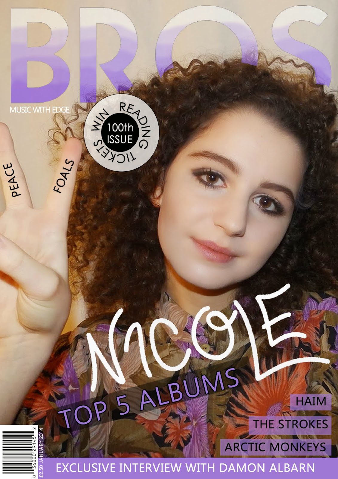
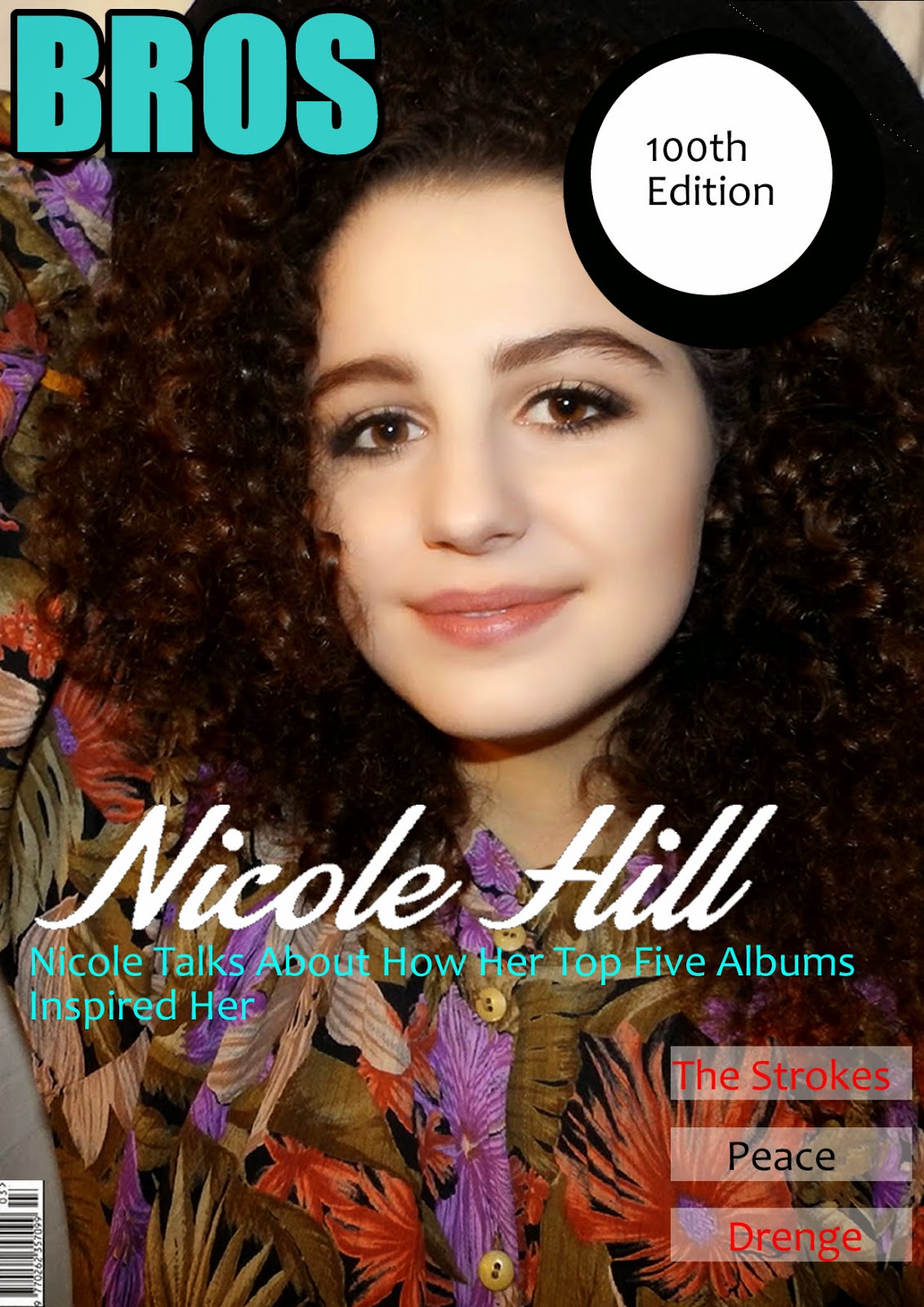
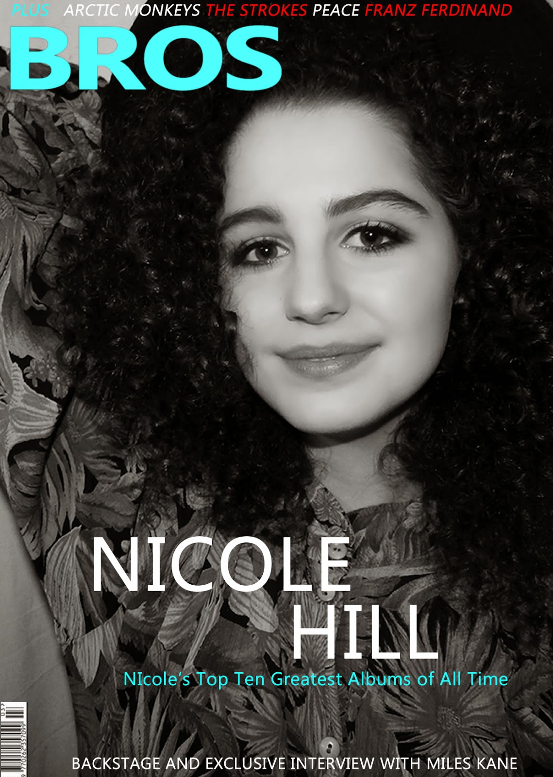
Even at the tender age of 18, Lauren Hill has oodles of records, which she can’t help but talk about. I mean who wouldn’t if you have a collection of 638, all from Foals to The Stooges, Kanye West to the Strokes. Being avid music fans, I bet we are all eager to know which ones, of the 638, are Nicole’s favourite. So here is Nicole’s Top Five Greatest Albums of All Time.

5. Arctic Monkeys – Whatever People Say I am That’s What I’m Not

Absolutely genius. The amount of personality put into this album is unbelievable. The album starts with ‘Anticipation has a habit to set you up, For disappointment’, boy was this album incredibly anticipated for, but I am definitely not disappointed. I think everyone heard snippets of the songs on Myspace (oh, the good old Myspace days), where evidently Arctic Monkeys gained national fame, even before the release of this debut album. Beginning the album ‘The View from the Afternoon’ has one of the best drum solos I have ever heard, Matt Helders definitely knocked it out the bag with that one. My song ‘Slip Up’ is based around the heavy drum solo which was influenced by Matt’s performance in ‘The View from the Afternoon’. Next was the oh so famous ‘I Bet You Look Good On The Dancefloor’ which brings the whole nation together, I mean I have never heard anyone not sing along to this cracking tune, undeniably one for the dancefloor. I have always wanted one of my songs to be like this, one that makes everyone get up and move, so I tried to create this with my song ‘Hipster Glasses’.  But the stand out of this album in definitely ‘When The Sun Goes Down’, track number 11. Wow. This song is catchier than the flu. It starts with the beautiful Alex Turner singing along to some clean chords, then it changes as the most pleasing riff is played on a bass guitar. I am proud to say that this album is one of the best of my generation and I am honoured that this masterpiece happened during my lifetime. One for the grandkids I think.


4. Bob Dylan – Desire

So imagine this, it’s 1976 and one of the greatest albums of all time is released, so what do you do? Do you go out and buy it or do you stay at home and do nothing? Well if you didn’t buy it you’re a bit stupid and you missed out, because this, my friend, is treasure. In my opinion Bob Dylan’s best album. I mean everyone probably already knew that Bob was a pretty awesome guy, but this just reinforced it. The album opens with ‘Hurricane’ which is about the Rubin Carter case. This is a great protest song, even the best song on the record. You can definitely feel the passion in the music (I means it’s more than 8 minutes long!). The song is basically a story, quite controversial but from the quality of the song, I can tell that a lot of effort was put into it, I think anger even raged Bob to write this song, but it is surely marvellous. My song ‘Free Forever’ was a protest song to free the band Pussy Riot, and I was definitely influenced by Dylan’s enthusiasm and passion. ‘Isis’ is the second track on the album with a beautiful country ring. Bob’s vocals are out of this world in this song and there is just something about it that makes it so wonderful. This folk rock song has no chorus, so it’s constantly changing and I kind of feel it gets better and better every time I listen to it. ‘Light in a Dark Valley’, the forth track on my album ‘Long Walk’ has no chorus as I wanted it to be like ‘Isis’, always changing. Track 4 is ‘One More Cup of Coffee’ it is a duet between Dylan and Emmylou Harris and it is perfectly executed. The song has an almost Arab, Middle Eastern vibe to it, which is what makes it so unique. Desire closes with ‘Sara’, a love song from Dylan to his wife Sara. This song is very personal and the emotion is felt quite deeply, with violins playing (conventional love song). I don’t know how he did it, I mean I usually hate love songs because they are cheesy as hell, but I think because of how powerful the song is, it doesn’t sound cheesy at all. So like I said if you don’t have this, go out and get it because there is some powerful stuff on here which will blow your mind.


3. Oasis – Definitely Maybe

I love Definitely Maybe. It’s such an optimistic album, being a debut album I don’t think anyone thought it was going to be as good as it actually was. I mean it was extremely good. If you were young in the 90s and you didn’t listen to oasis, you’re not cool, sorry. So the album starts with ‘Rock ‘n Roll Star’ which sets off the mood for the whole album. It’s just what a rock song should be like, just ten times better. There’s a reason why Oasis were so big, and it was for songs like this. Awesome lyrics and they just play really well. At the time this type of music was quite unique and gives a little twist to just rock music. ‘Live Forever’ is the 3rd track and it’s just a happy song. There’s a pretty decent guitar solo in there and it’s just about being happy, yet it’s still got that edginess to it, at the same time it’s soft and tender. At the time grunge music was in, and Oasis was like a ray of sunshine compared to it. I think Oasis and especially this song ‘Live Forever’ is what inspired me to make my album as positive as possible. I just want people to listen to my music and be happy, just like people did with Oasis. Track number 6 is ‘Supersonic’. Again the content of this song is top quality and pretty exclusive. It sort of reminds me of The Doors psychedelic rock. Pretty much all the songs on this album have their own identities. 8th track is ‘Cigarettes and Alcohol’ which is pretty different to all the other songs as it shows Oasis’ wilder side. It talks about having fun but at the same time being happy, which is the aim of the album I guess. This album definitely picks you up from a downer because of the lyrics, they’re very uplifting. Oasis was the centre of the Britpop craze, and they should be for good reason. This album deserves to be known by everyone because it’s pure genius.
2. Pink Floyd – The Dark Side of the Moon

1973 saw the birth of this baby. My beloved ‘The Dark Side of the Moon’. There is a reason why it spent more than 11 years in the UK album chart, because it’s absolutely FAB! It starts off with ‘Speak To Me’, the overture of the album. It’s basically just an instrumental and then it goes straight onto ‘Breathe’, which is smooth and tranquil. I think this could even calm down a little toddler throwing a tantrum. The introduction has somewhat a blues based vibe to it, which ultimately gives Pink Floyd their own signature. In my song ‘Fan of the Century’, I used the same 12 bar blues as ‘Breathe’, again to give it that bluesy feel. Track 4 is ‘Time’ which starts off with clocks chiming, funnily enough, and then it’s followed by a two minute drum solo, done on rototoms. After the little introduction, starts an amazing rock song. Lyrics are good, David Gilmour and Richard Wright sings perfectly and the electric guitar solo is magnificent. The guitar solo in my song, ‘Stare At Me’, the second track on my album, ‘Long Walk’ was very much influenced by ‘Time’. ‘Money’ just makes me want to move my body in all crazy ways, again with that amazing bluesy feel, this song is ‘eargasm’ material. I definitely feel like this inspired many Black Keys songs. ‘Money it’s a hit’, yes, yes it is. This is definitely my favourite song on the album, it just makes me feel so powerful, probably because they’re singing about money. The Dark Side of the Moon honestly takes my breath away, it puts butterflies in my stomach. It is a jewel among many stones.


 1. The Smiths – The Queen is Dead

So here it is, the crème de la crème of all of my favourite albums, it is the glorious ‘The Queen is Dead’ by The Smiths. You’re probably wondering why I love (an understatement) this album so much, well apart from irresistible lyrics, filled with daring puns, and the exciting texture of the music, this, to me, was one of the most fulfilling things I have ever heard. I honestly don’t know how I lived before hearing this record, because this changed my life. It was after detecting these beautiful sounds, did I push myself to want to write something just as endearing. The opening track ‘The Queen is Dead’ has a short tom-tom loop which is repeated over and over again through the whole song. This is what inspired the tom-tom loop in my song ‘Over the Hill’. It is a pretty authentic sound and as the beat is not changing, the lyrics just flow and it doesn’t just sound like a few guys playing in a room together. ‘Bigmouth Strikes Again’ has the acoustic guitar playing through the whole song, while still having edge and not detracting from the content. I wanted my songs to have this kind of edgy feel, while still having my signature acoustic guitar. I tried to recreate something like this in my song ‘Take it or Leave it’. ‘There is a Light That Never Goes Out’ was my first Smiths’ song and it was what made me begin my musical journey. At the time, to me this was one of the most exquisite sounds, that is why I decided to do my own cover of it, which is on my debut album, ‘Long Walk’. I will just lose myself listening to this album and it feels like I’m in a different world (and I’m not even high!). If you haven’t listened to this album before, you are missing out on the finest experience of your life. The Queen is Dead is the best musical accomplishment of all time.


Tuesday 7 January 2014

First Mock up

The Masthead is at the top left of the page as this is the first place people look. It is the largest text on the page and is in bold, bright and turquoise font which stands out against the black and white main image. It fits in with the house style which is white, turquoise and red.
The first bit of the Headline 'Nicole Hill' is in large, white font which stands out against the black and white image, it is larger than the second bit of the headline so the artists' name stands out. This will attract fans to the magazine. The second bit 'Nicole's Top Ten Greatest Albums of All Time' is in a smaller font that is in a turquoise colour. This is for variation and so it stands out against the dull background.
There are coverlines at the top and bottom of the page. At the bottom it says ' Backstage and Exclusive Interview with Miles Kane' in small, white font so it contrasts against the background. At top of the page there is another coverline saying 'Plus Arctic Monkeys The Strokes Peace Franz Ferdinand'. 'Plus' is in blue font, 'Arctic Monkeys' and 'Peace' are in white font and 'The Strokes' and 'Franz Ferdinand' are in red. This is so they alternate and you can tell that they are coverlines. As they are at the top and bottom of the page they replace banners. I didn't put the coverlines near the Headline as I wanted the image to stand out and I didn't want to be cluttered, so it doesn't follow normal conventions of a front cover.
The main image is in black and white and is a close up. The model is looking at the camera, making eye contact with the audience.    

Edited Photos